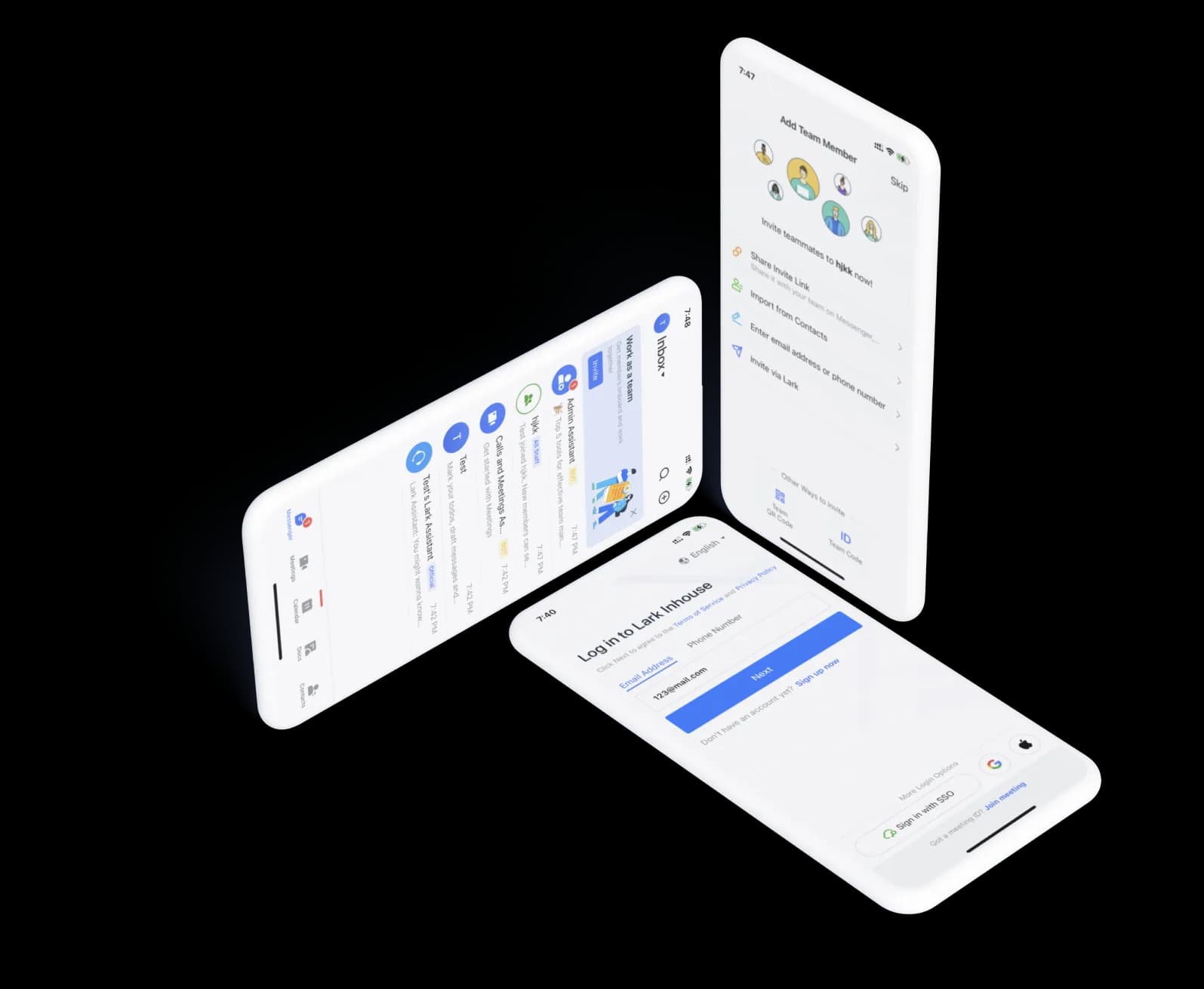
Overview
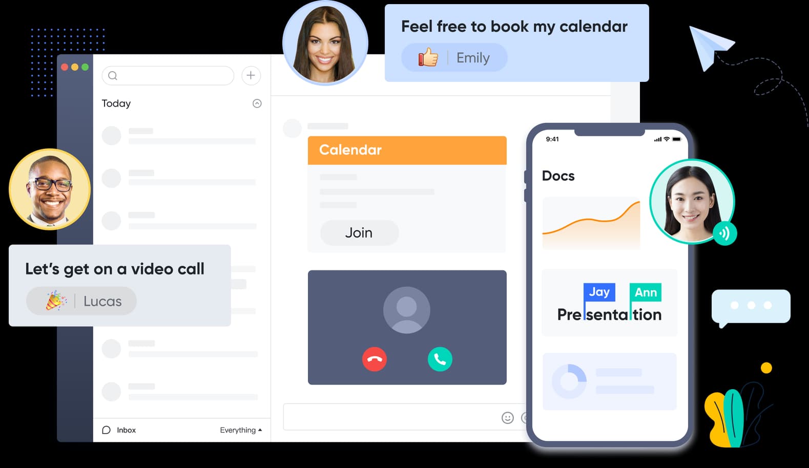
Lark is a collaboration office suite designed for business management and communication. Launched in March 2019, this collaborative suite struggled to scale alongside the diversification and fulfill the hyper-growth of user needs. In 2021, Lark's onboarding phase was challenged by fundamental usability and data security risks.
My role
As a UX designer, I worked cross-functionally with the development, UX content, and product team to streamline and optimize the service of the Lark onboarding process across platforms. I participated in the end-to-end product development from research to iterations, from pain points to user feedback, from ideation to final product.
- Scope
- Serve as SaaS
- Team
- 5 Engineer
1 Data scientist
1 Product manager
2 Product designer - Form
- Cross-platforms
Mobile&Web app - Duration
- 8 weeks
01
User insights & ideation
I partnered with two product managers and one data analyst to uncover insights and findings that address pain points for the user journey
02
Localization strategy
I designed new features to face the challenge of cut-throat competition and prevent potential data risks.
03
Scope definition
I defined core problems and formed prototypes to share UX strategy and design principles to spread ideas further and achieve alignments among teams.
04
Design execution
Our team has developed six different devices. I proposed user journey maps and wireframes. I am especially in charge of mobile and web app interfaces
05
Business & design balance
I drove decision-making with product managing partners to balance achieving business goals, providing a positive user experience, and gaining buy-in from stakeholders.
06
Proactivity & leadership
I prioritized and negotiated content strategy and design decisions for launch and beyond. I also coordinated the project timeline to ensure we met our milestones.
Impact
The onboarding redesign drove 45% higher conversion and 36% more engagement
Through qualitative and quantitative research, we defined the problem, reiterated the wireframes, and ideated the final design with cross-team collaboration. Here is our generalized achievement and impact:
- 18
- one-on-one interviews
- 6
- expert interviews
- 3000
- surveys
- 11
- weekly component sync
- 6
- cross-team sync
- 12
- user testings
- 45
- % increase in conversion rate
- 36
- % increase in product engagement
- 30
- % increase in safety perception
The Challenge
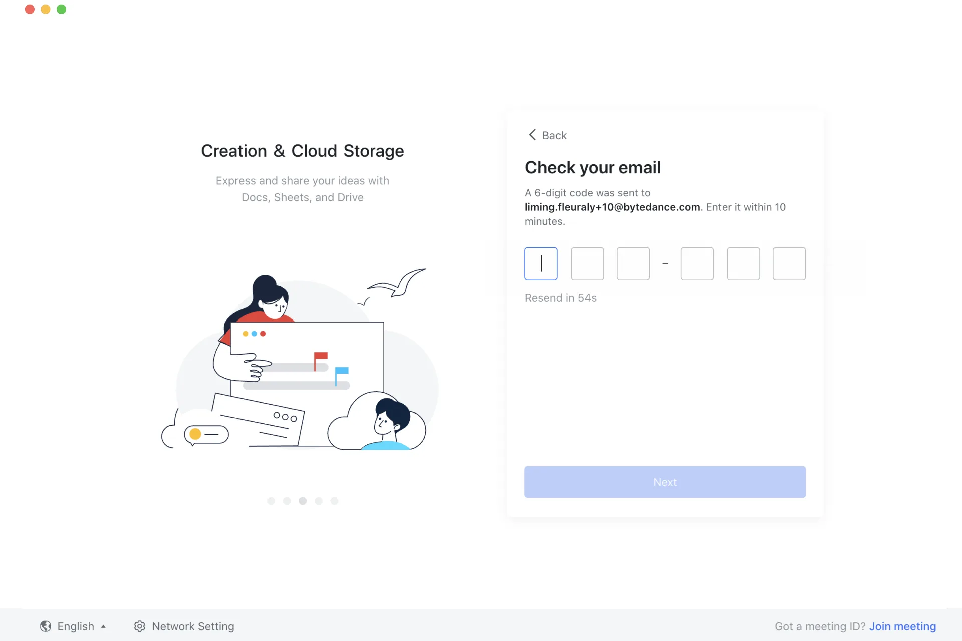
The conversion rate of new user to active user is lower than expected, as users do not realise the full use of the Lark office tool.
As a next-generation collaboration suite, Lark differs from other office tools in methods of use, organization charts, and potential goals. However, the conversion rate of new user to active user is lower than expected as users do not realize the full use of the Lark office tool.

The Approach
Mapping out user journey and bandwidth through cross-team collaboration
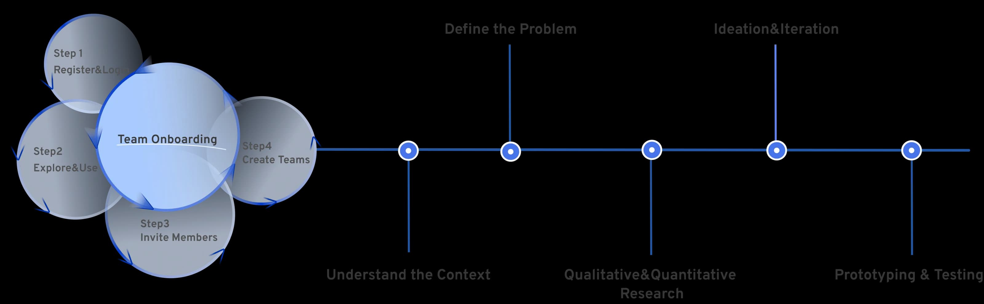
At the outset of this project, we did not have a clear mission or pre-existing goal for the design of the team onboarding process. Therefore, I partnered with data analysts, user researchers, and product managers at different phases to embrace the evolving and changing user needs within the onboarding process across user registration, function exploration, member invitation, and team formation. Below is our research and design process.
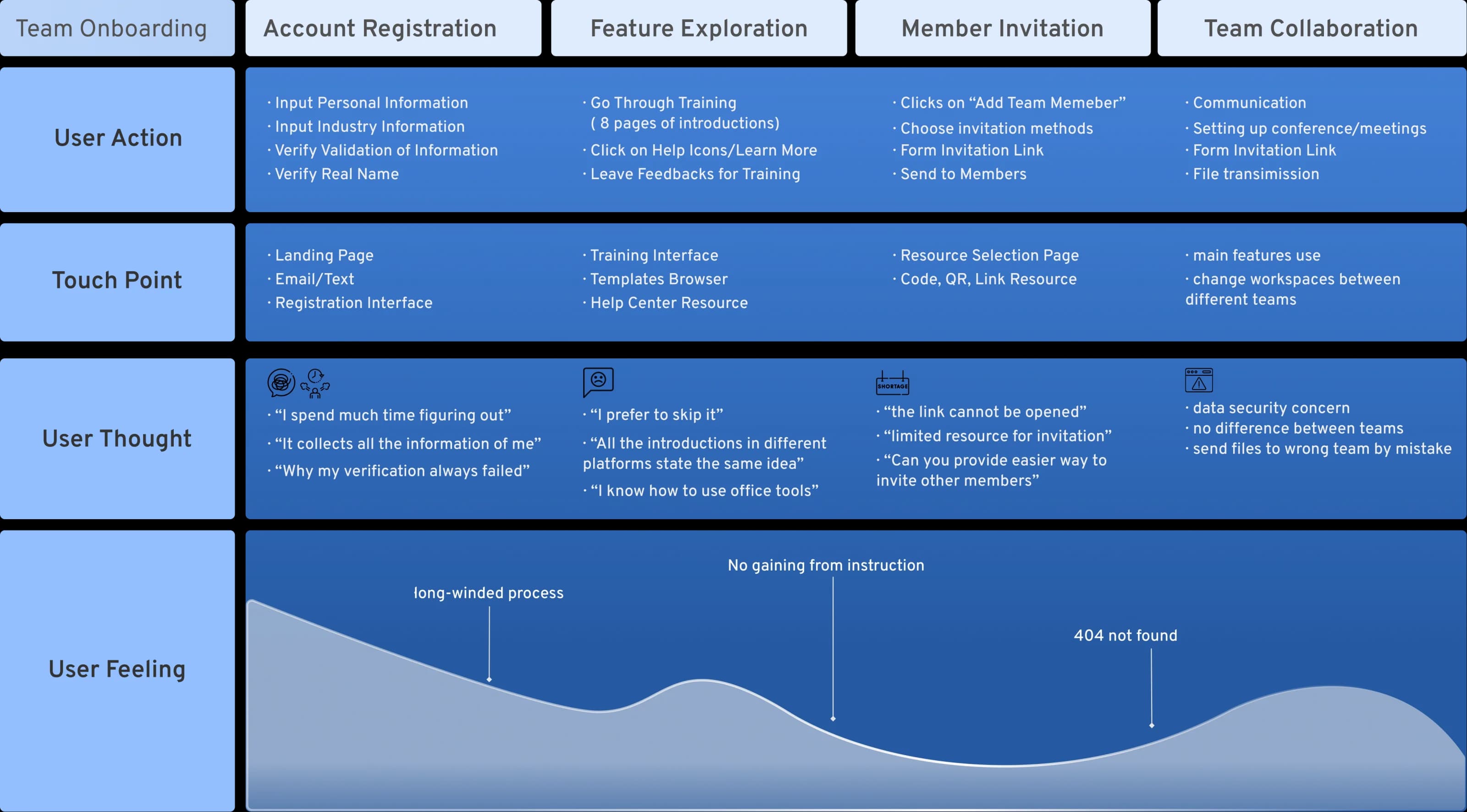
Discovery 01
A time-consuming process detracts from its user-friendliness
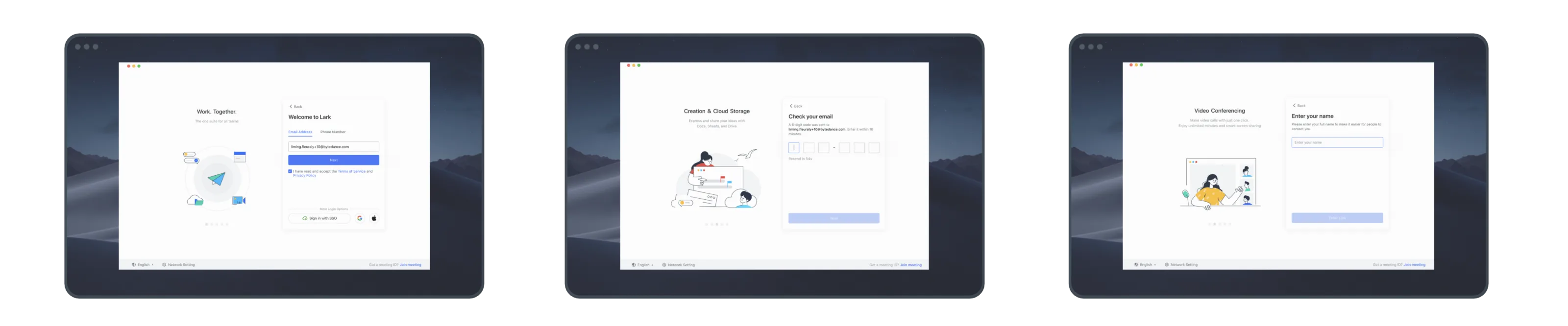
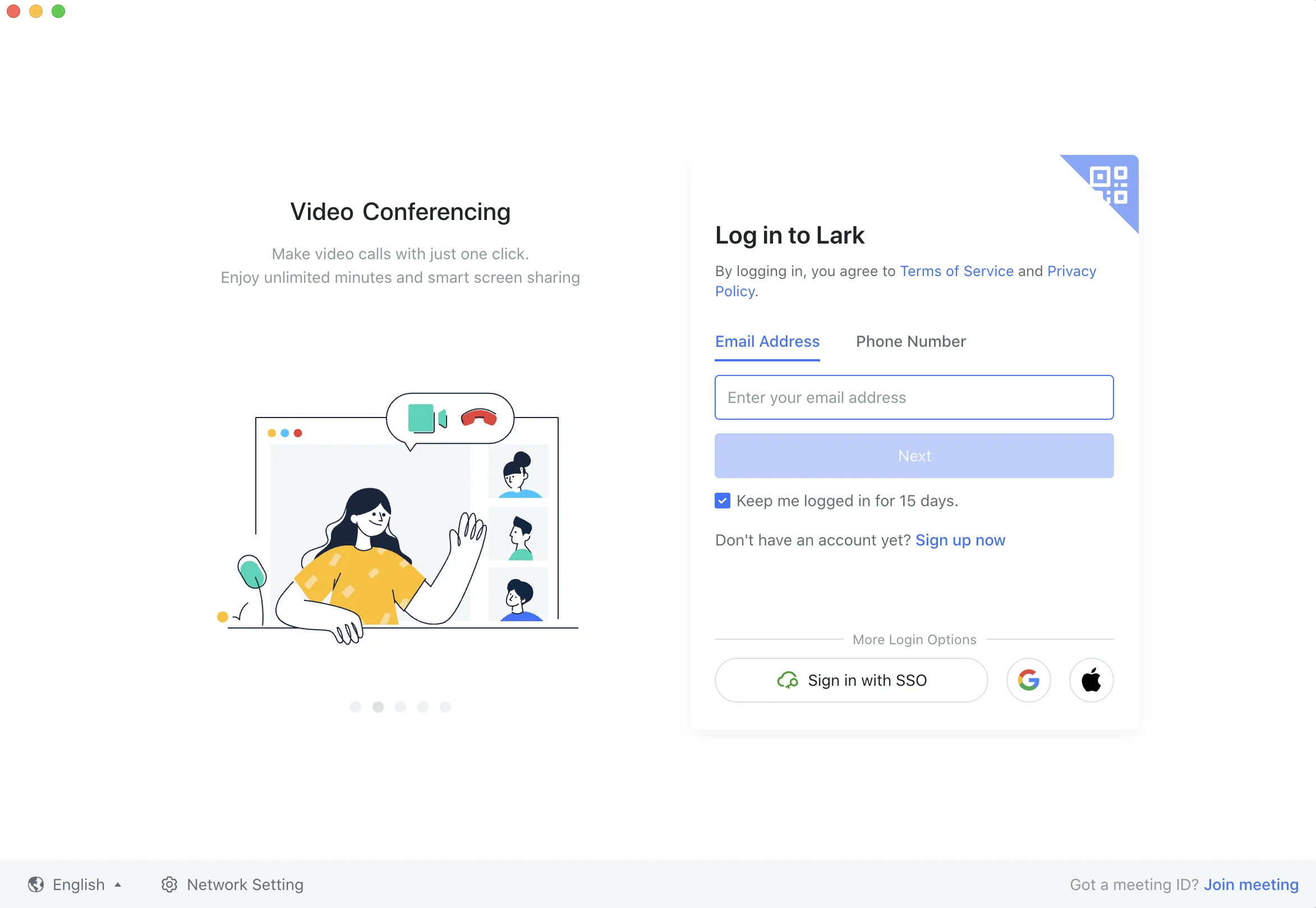
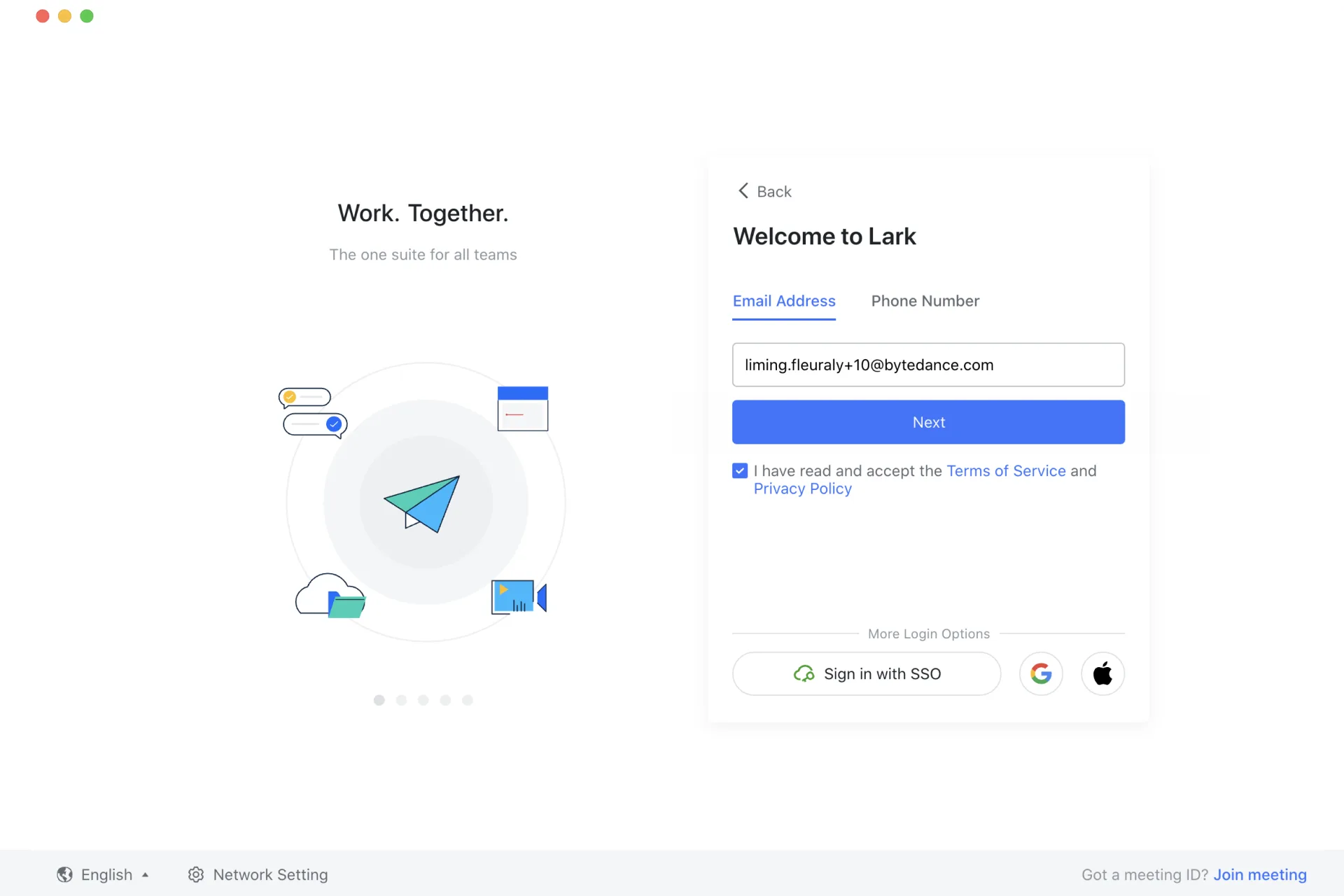
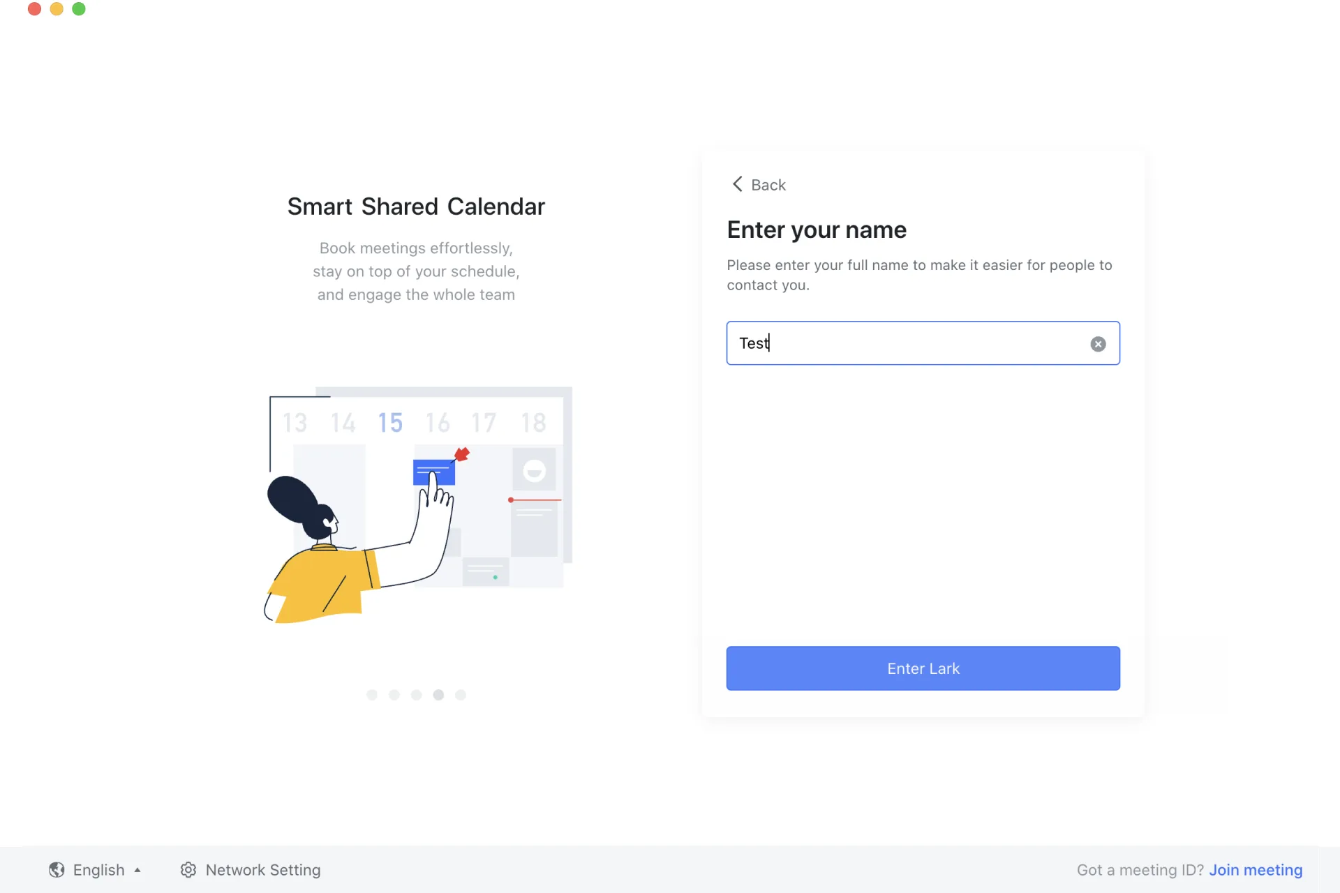
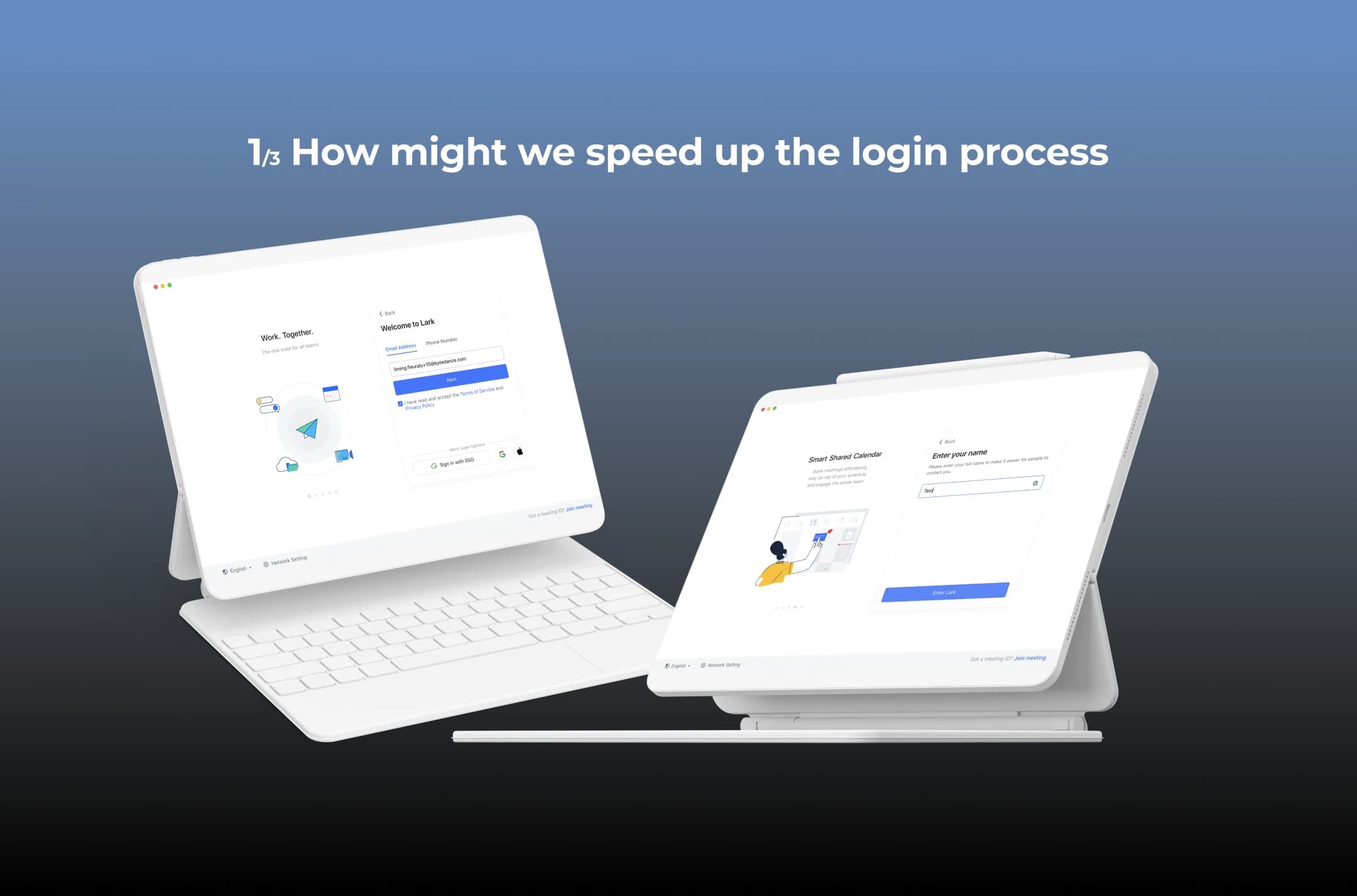
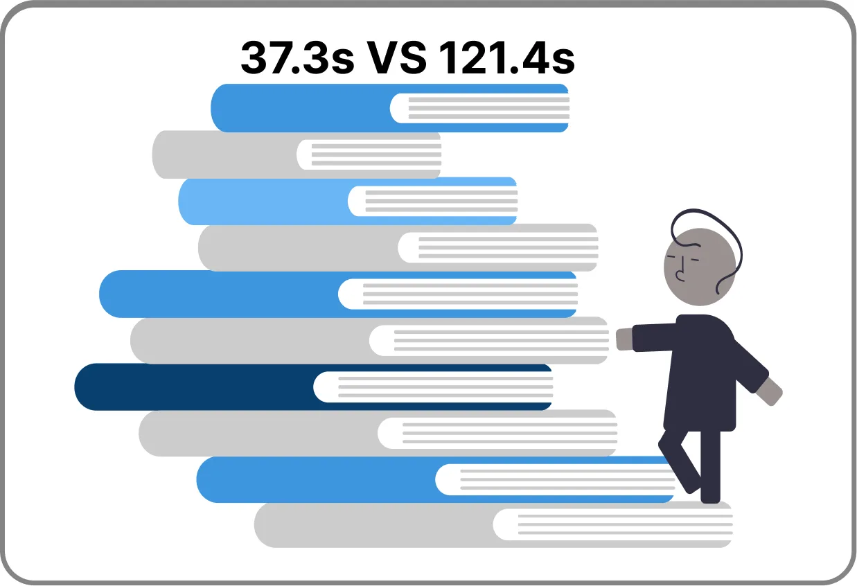
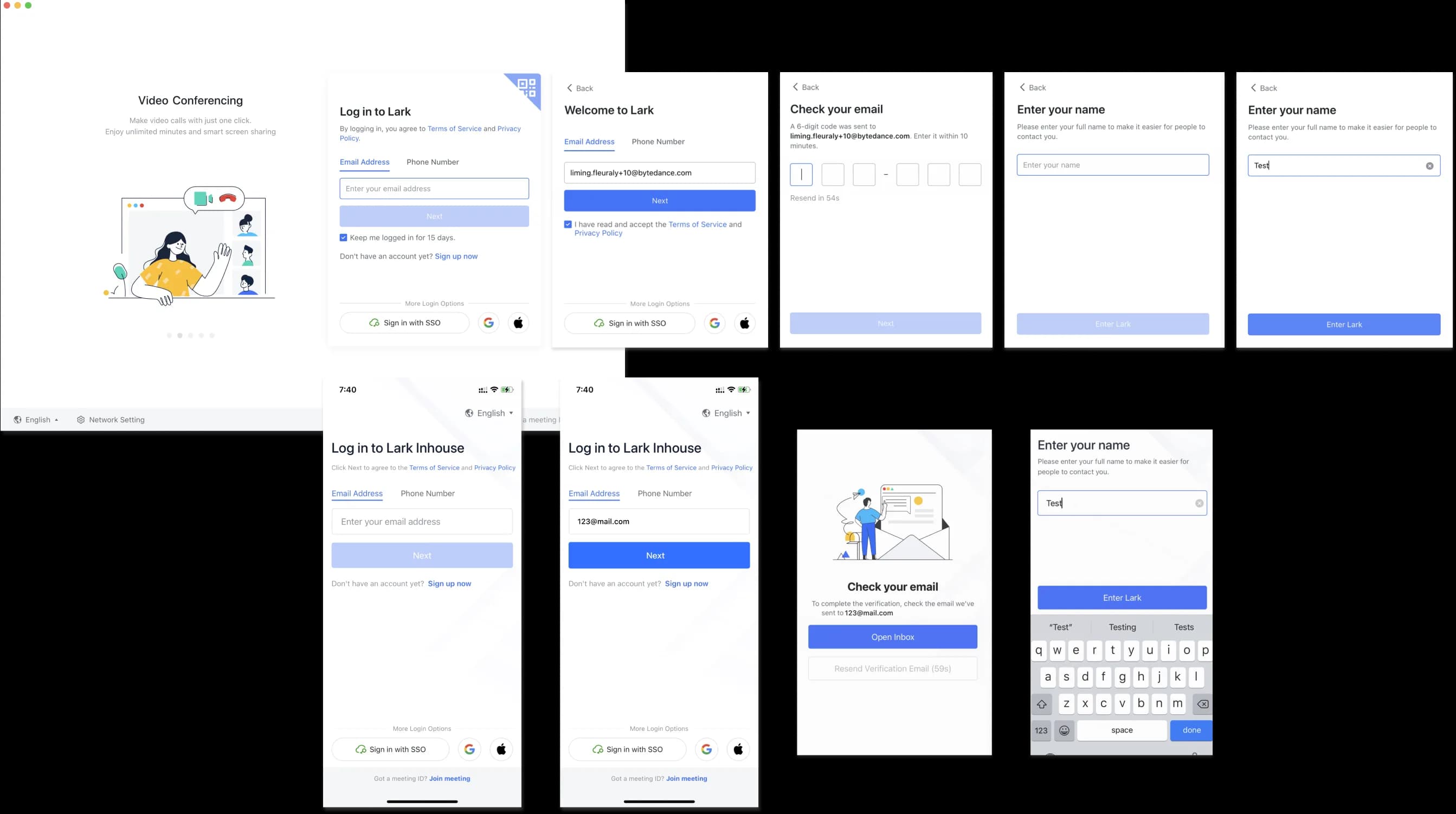
We conducted customer and market research to drive our planning phase. The key insights that define the pain points in the registration process are:
Design
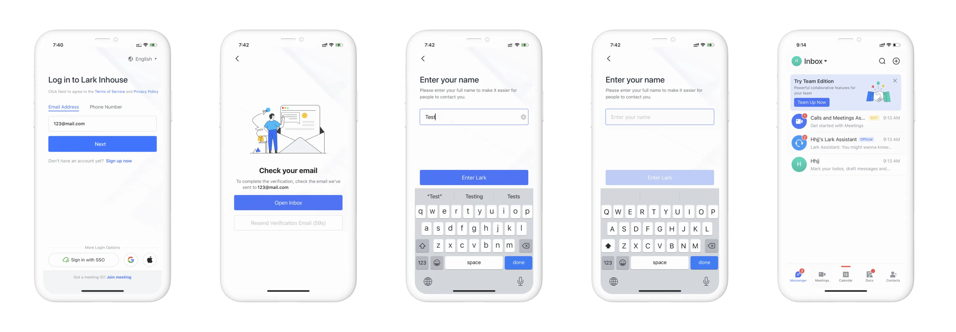
A faster, more accessible and user-friendly design

Discovery 02
Users used to skip the feature tour
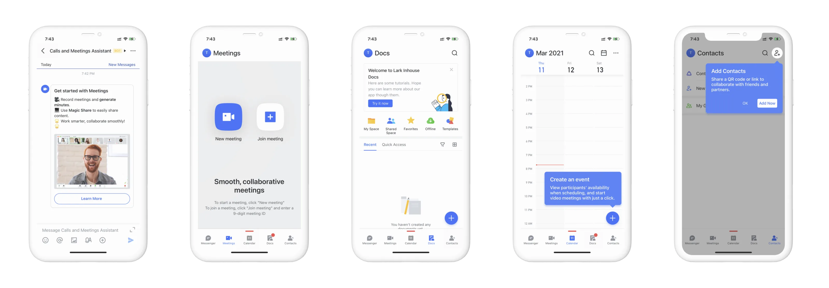
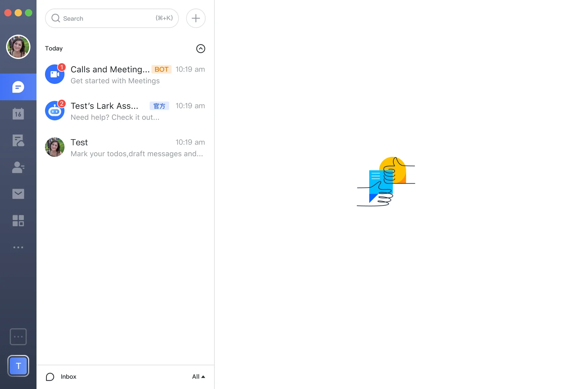
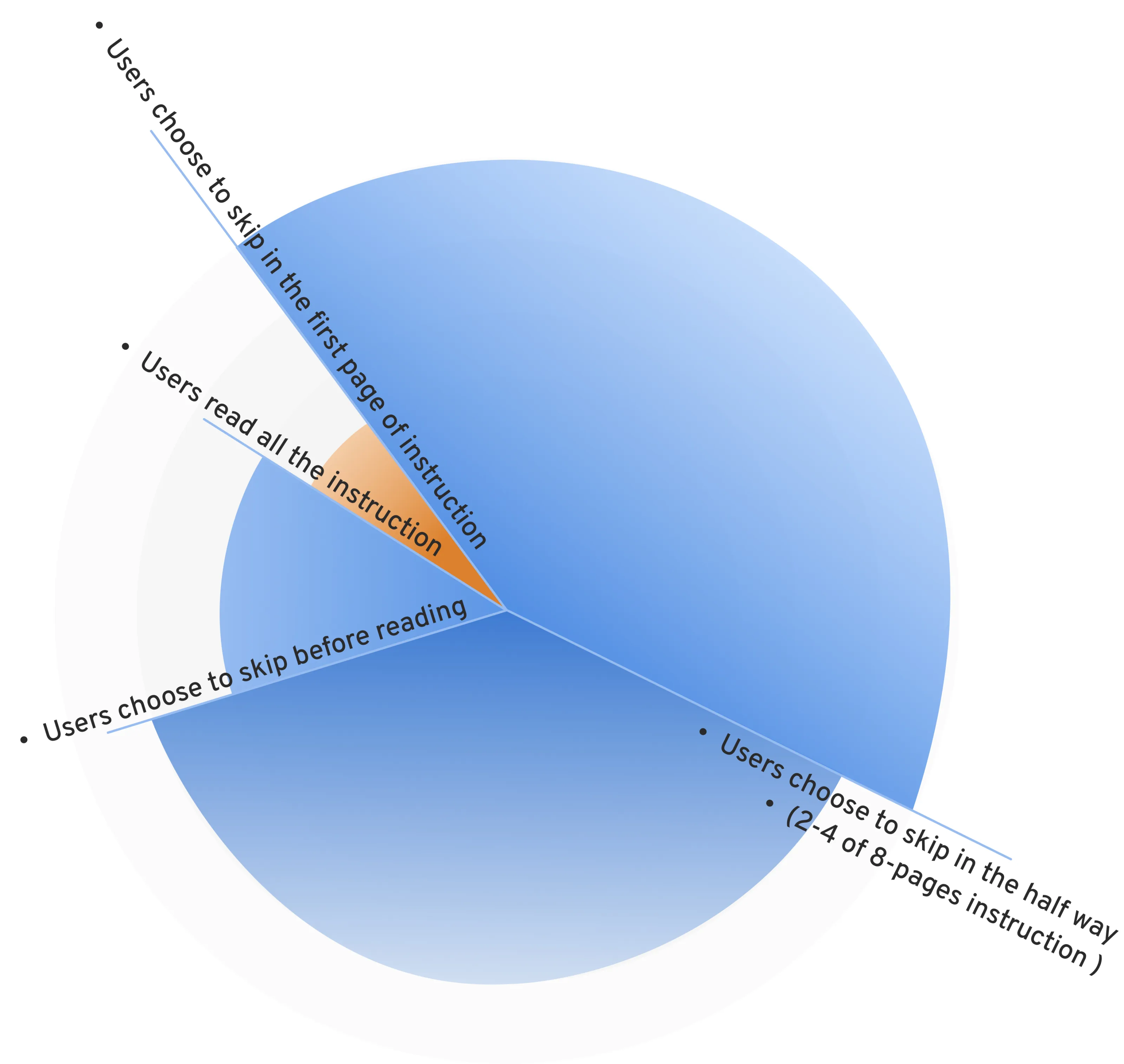
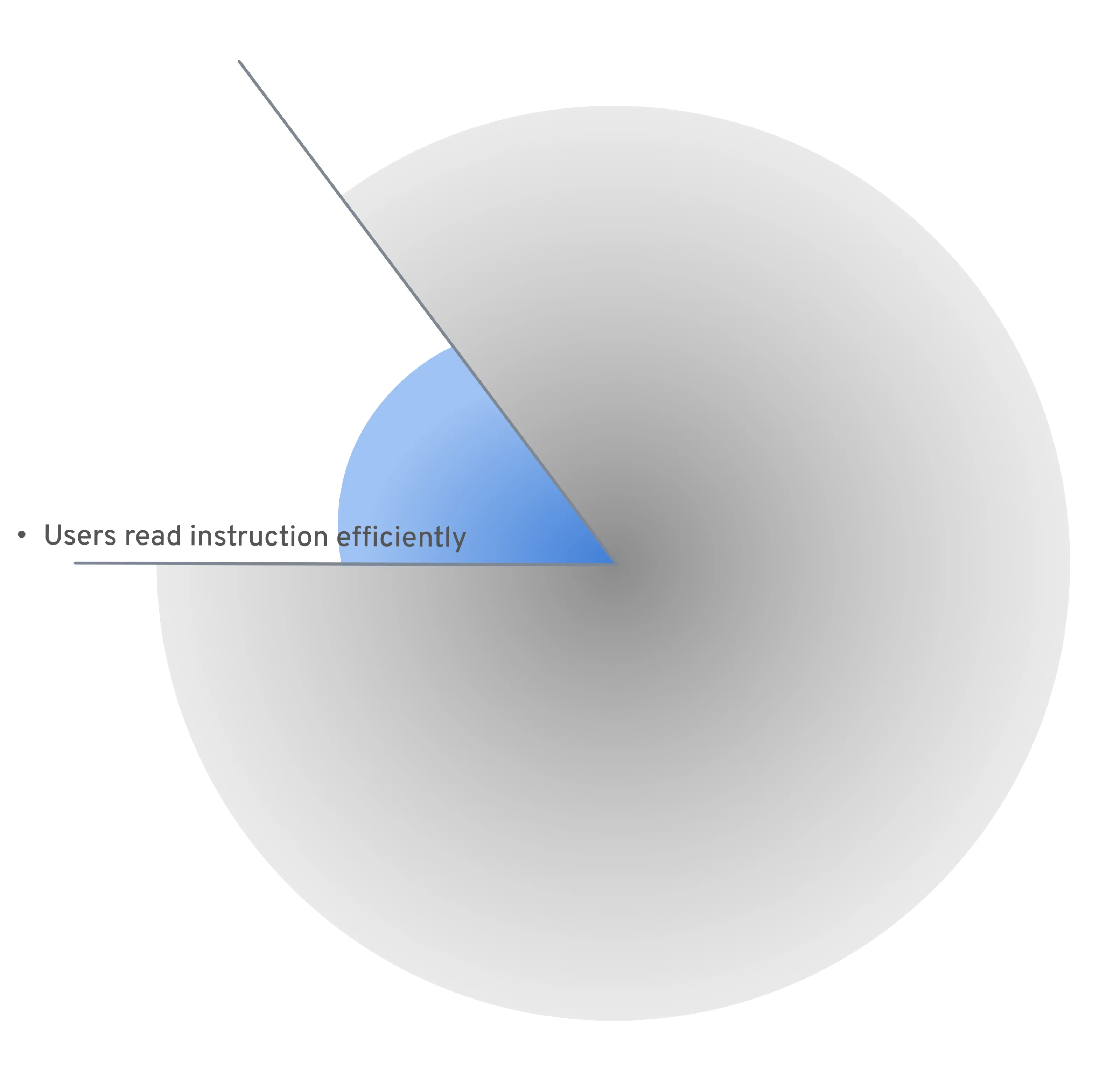
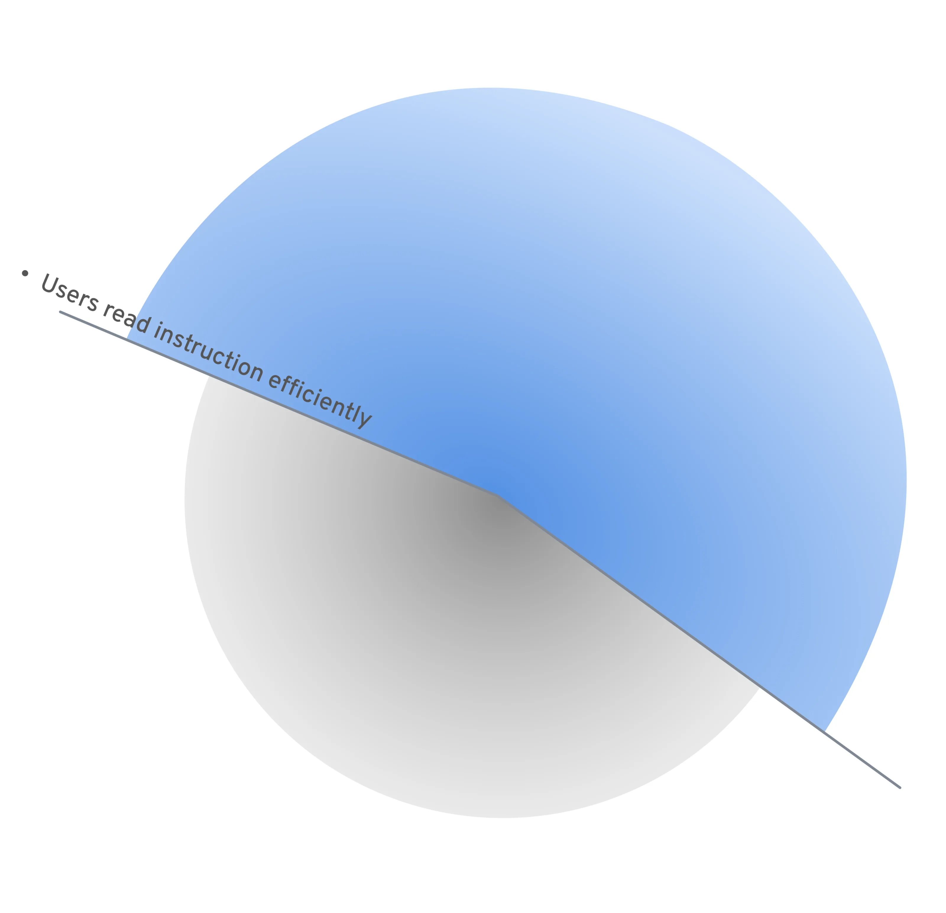
Upon successful login, users will see eight pages of illustration in Lark’s previous feature tour. However, users do not want to spend time reading through pages of instruction, so they choose to skip this section.
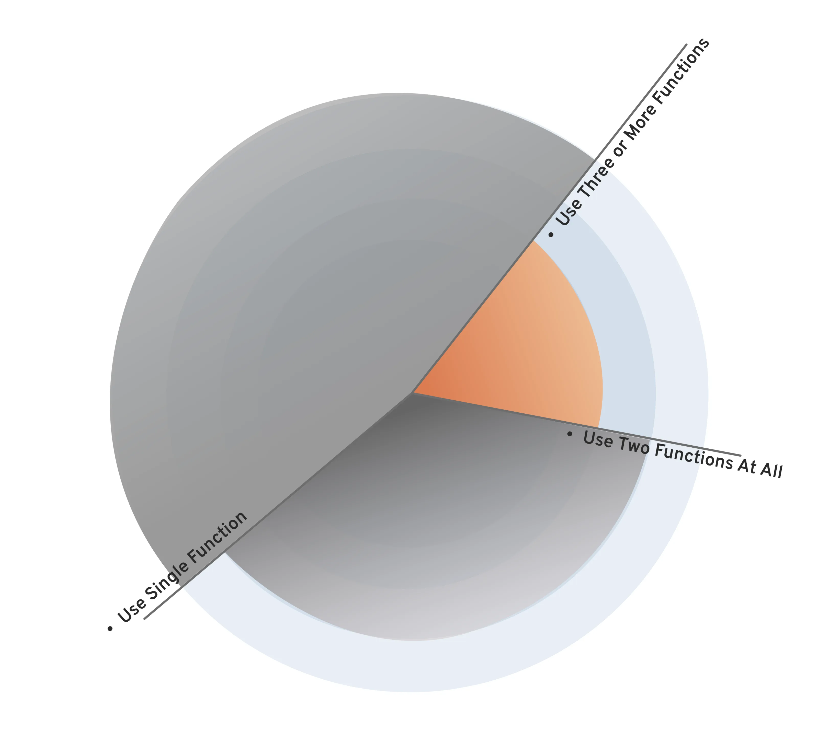
To verify my assumption, I asked the data team to read the information related to the feature guidance step and visualised it: less than 10% of people will fully view the 8-page feature instruction.
Solution 02
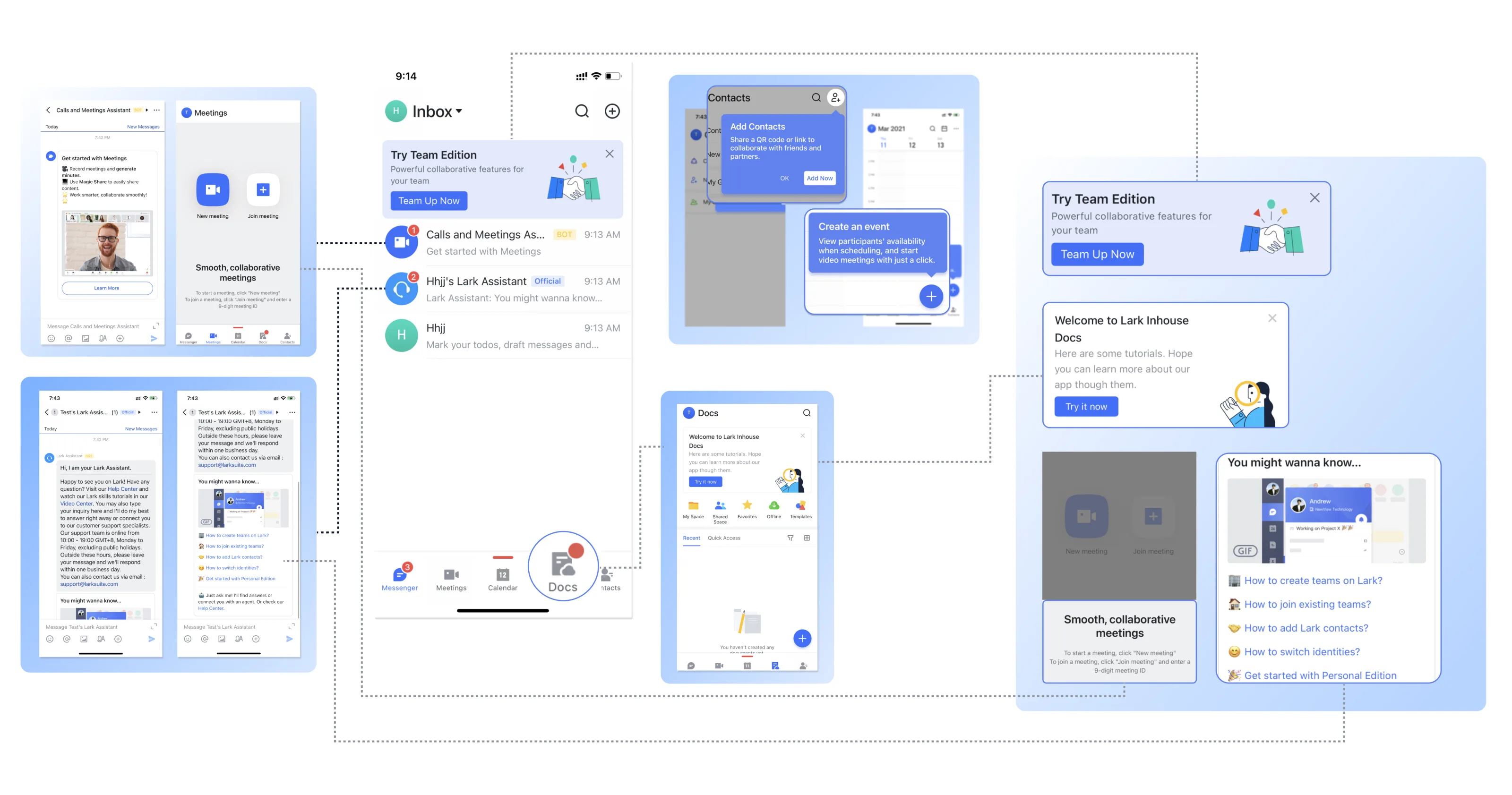
Anticipate user needs before starting the tour
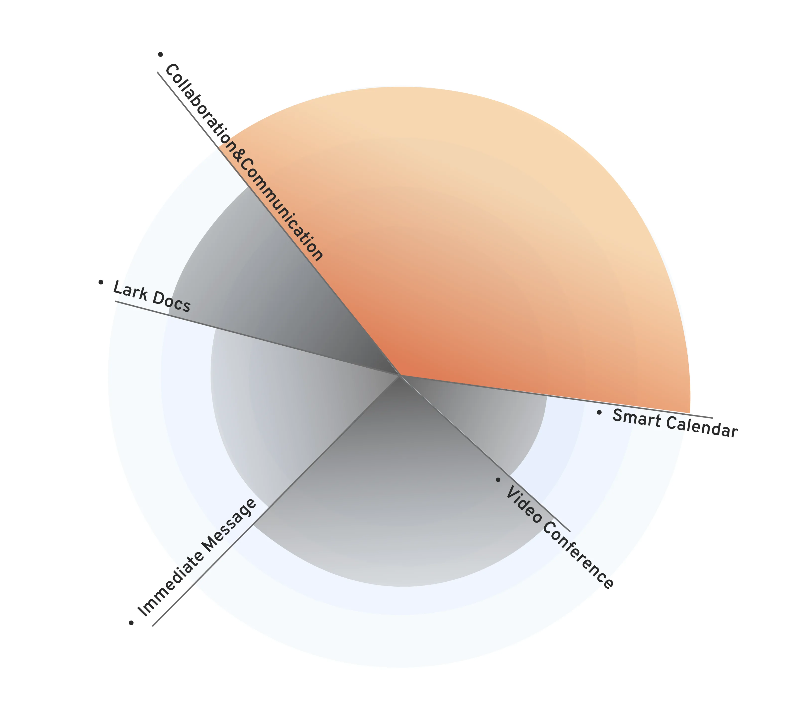
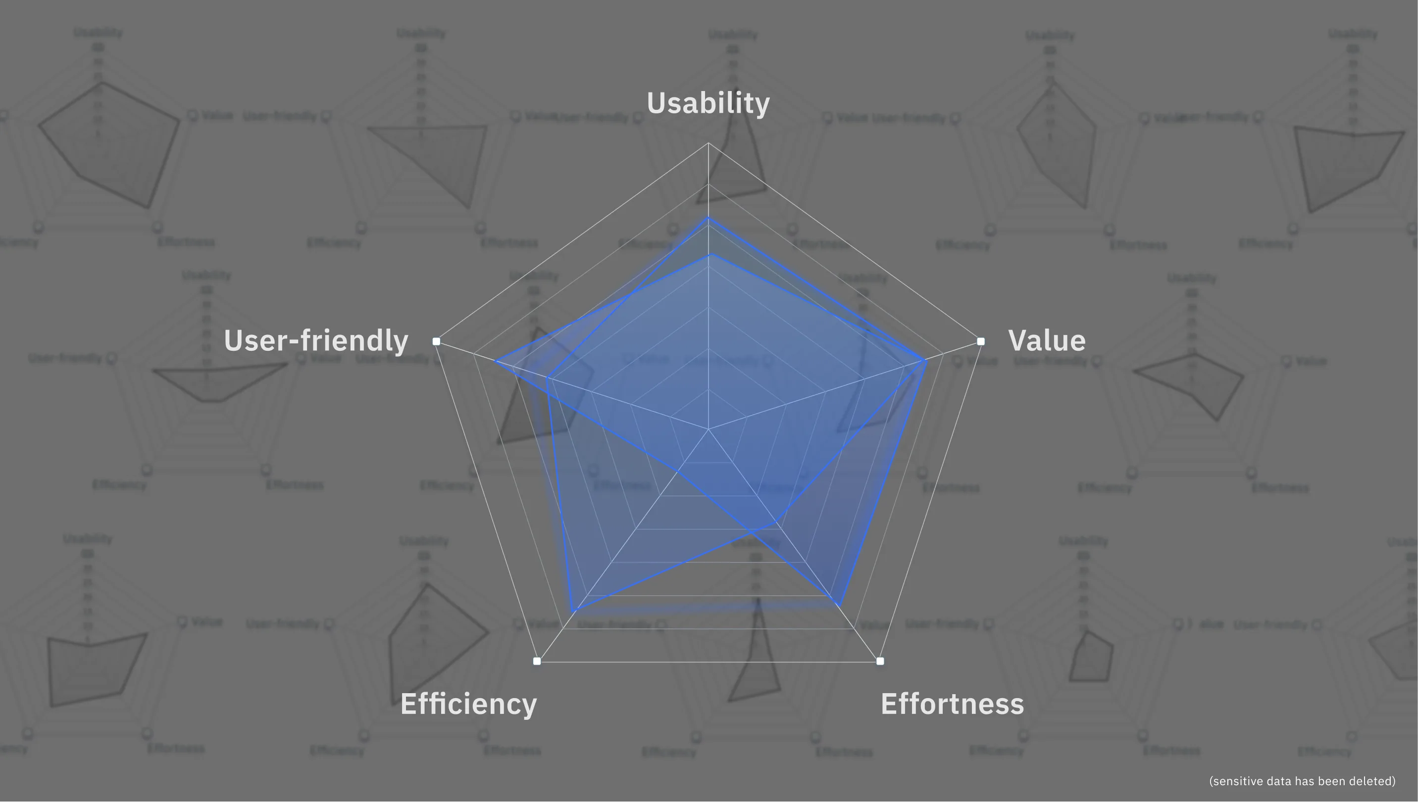
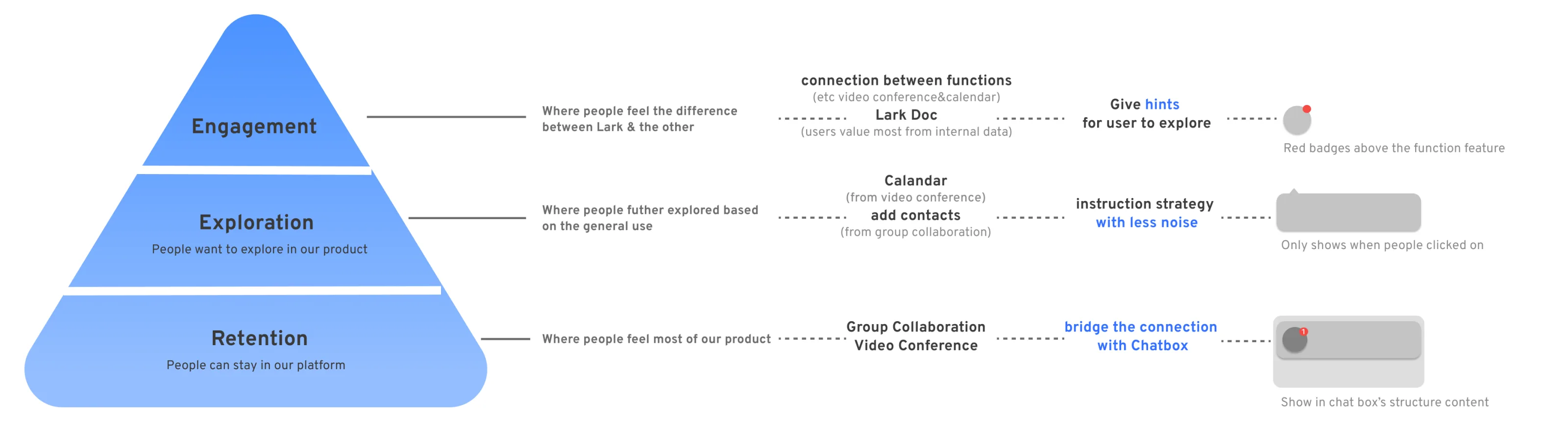
With insights from competitor analysis and expert interviews, I determined that guiding new users through their first platform use would be a better strategy for Lark. Then, with further research, I applied personalised contextual guidance in the user experience to make it less noisy but more engaging.
Conduct A/B testing to secure the final success
To ensure that this design strategy can be successfully applied to our platform, I also conducted an A/B test with assistance from the product management and business development teams to support our assumption. Finally, I made the final design decision based on the expected result from the test.
A provocative, enlightening, and efficient design
Adapt an appropriate guide for each main function, so guidance arrives in context instead of as an eight-page tour up front.
Discovery 03
An industry competition blocks user invites from other platforms
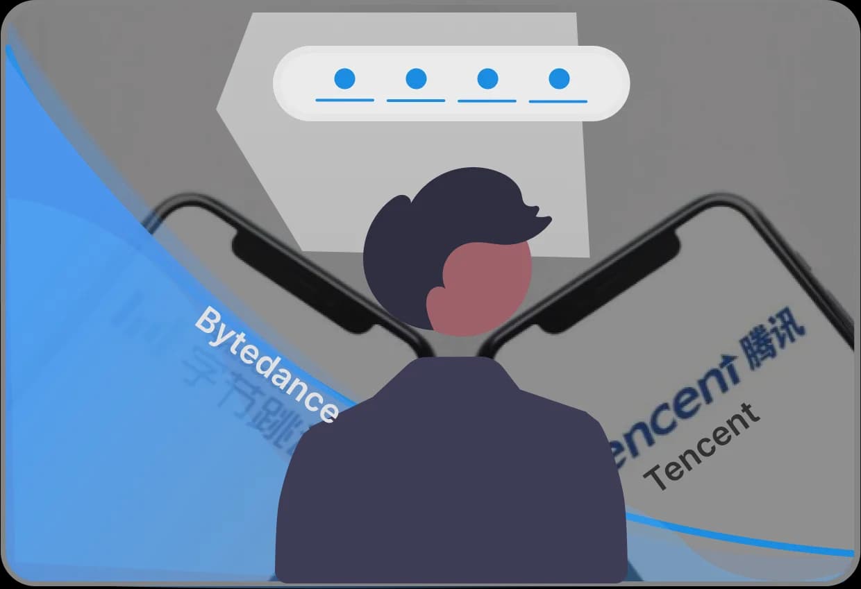
The hyper-growth of Lark sounded an alarm to other business platforms in China, such as WeChat Work (Tencent) and DingDing (BABA). Those companies started acting to hinder the path of Lark’s expansion — they block the spread of Lark’s invitation links on their platforms. The lagging method of member invitation exacerbated the downstream trend of new users joining.

Solution 03
Explore appropriate and popular methods in the Chinese social networking ecosystem
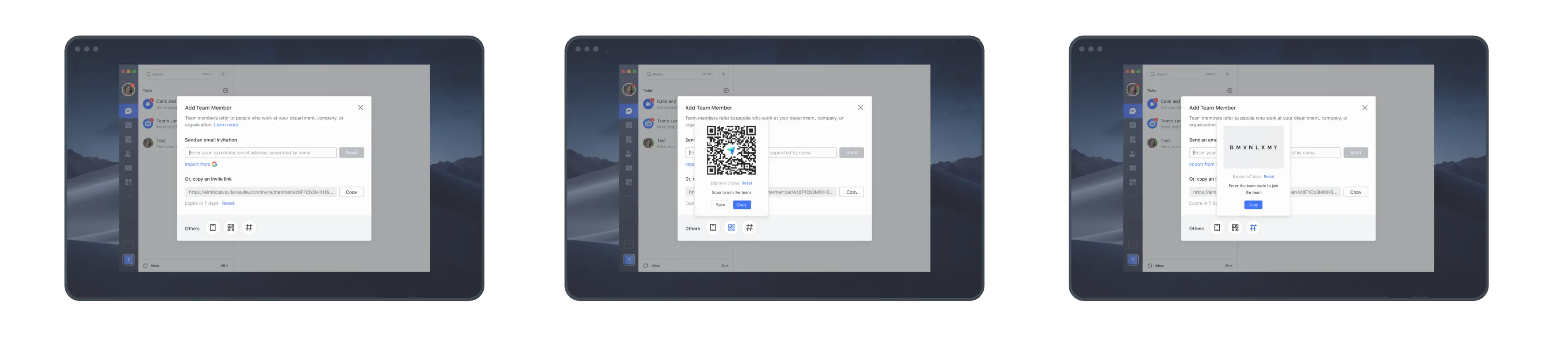
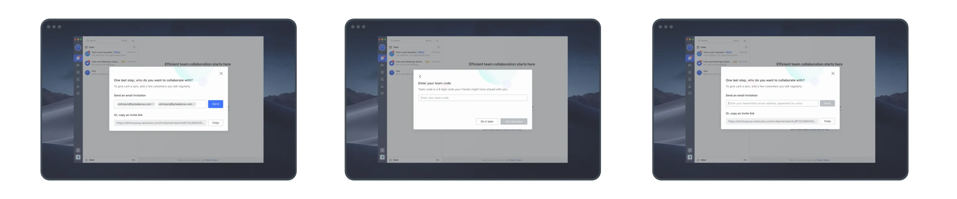
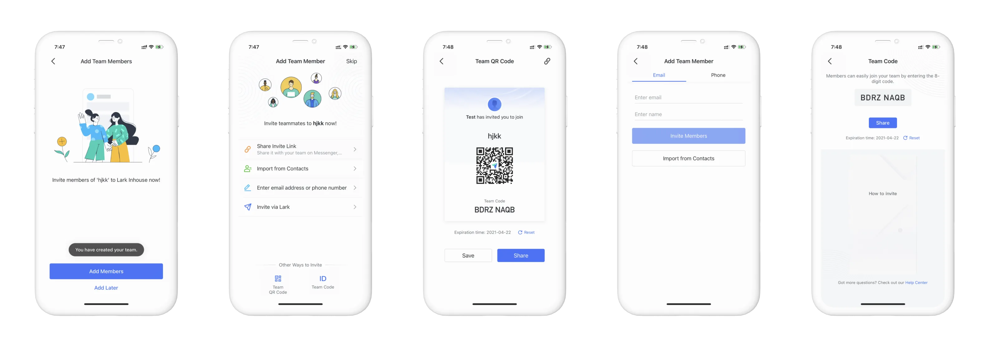
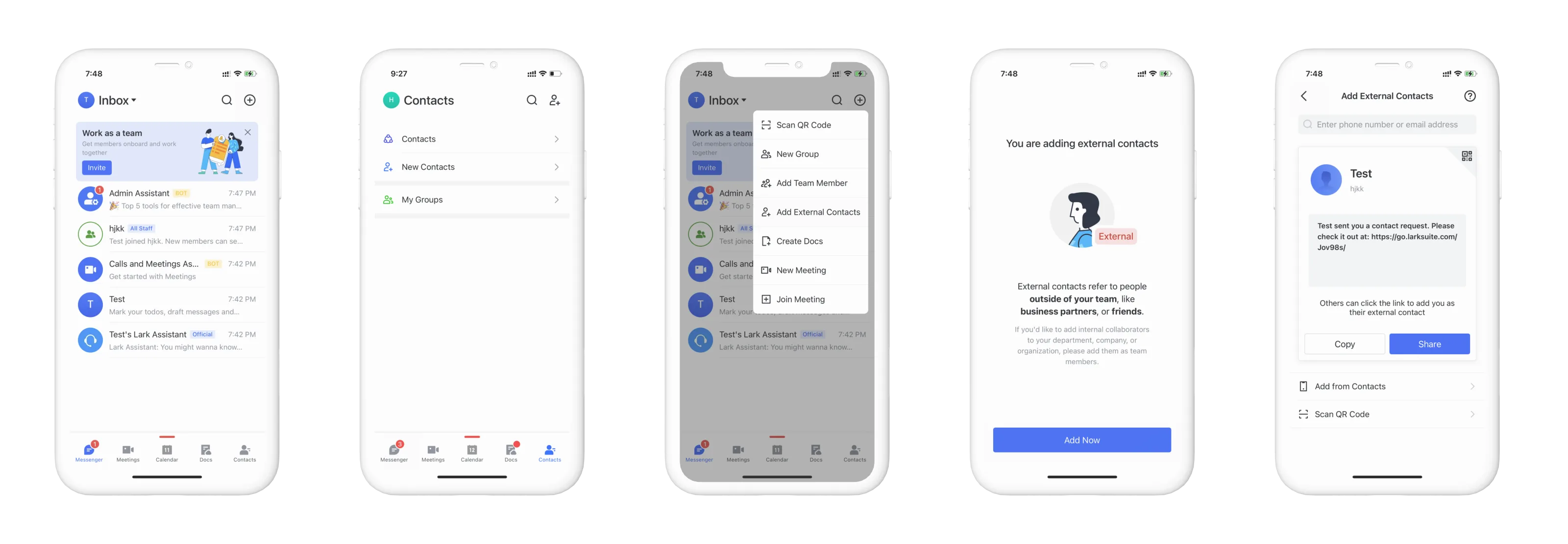
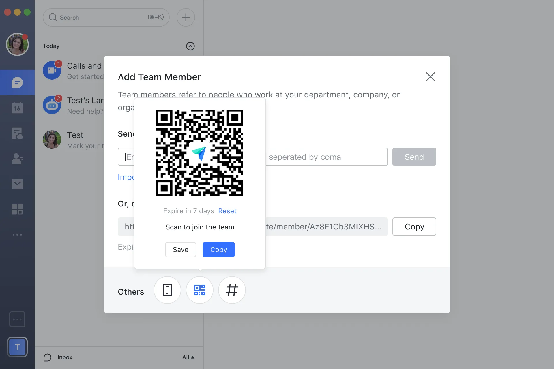
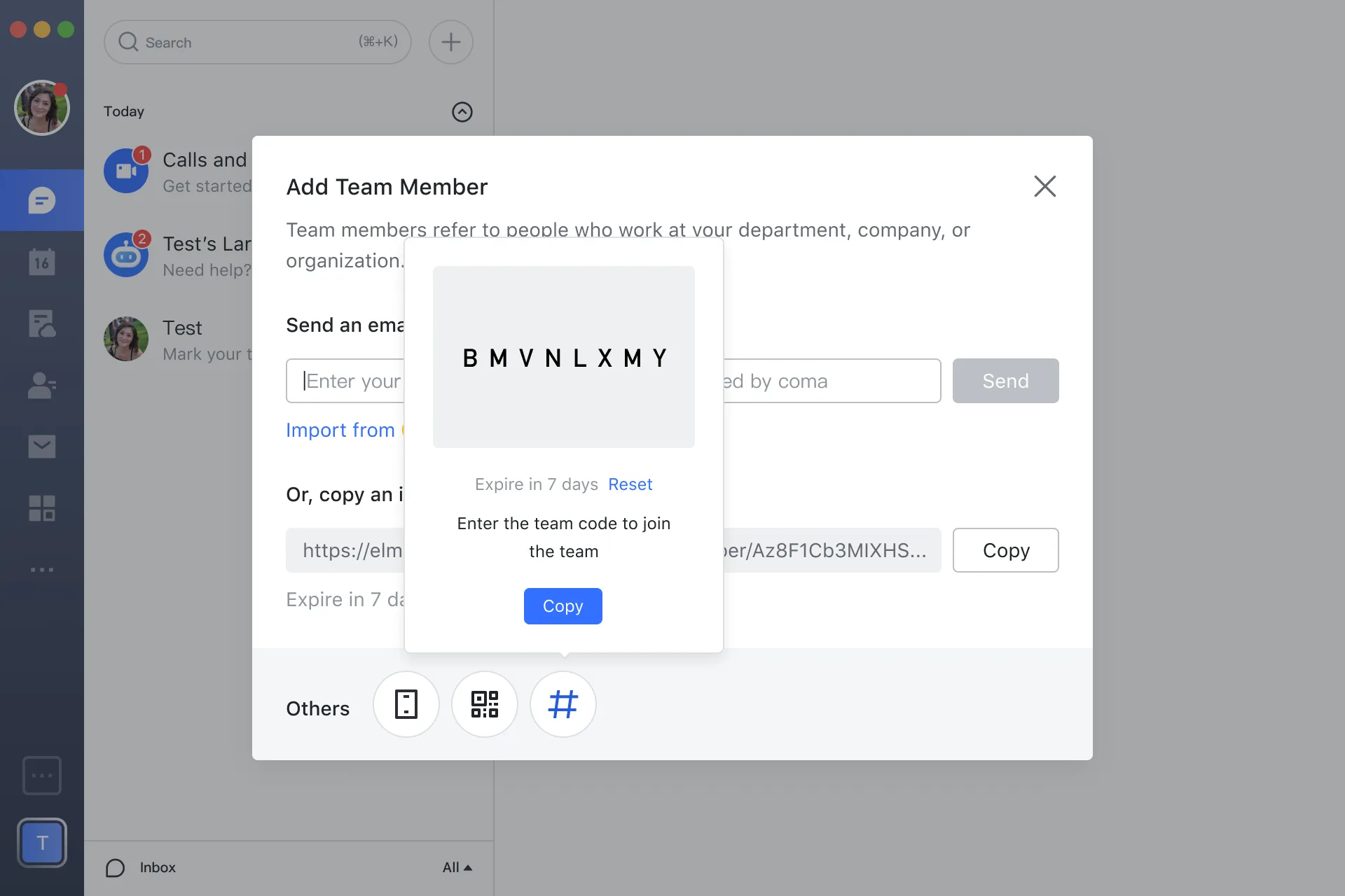
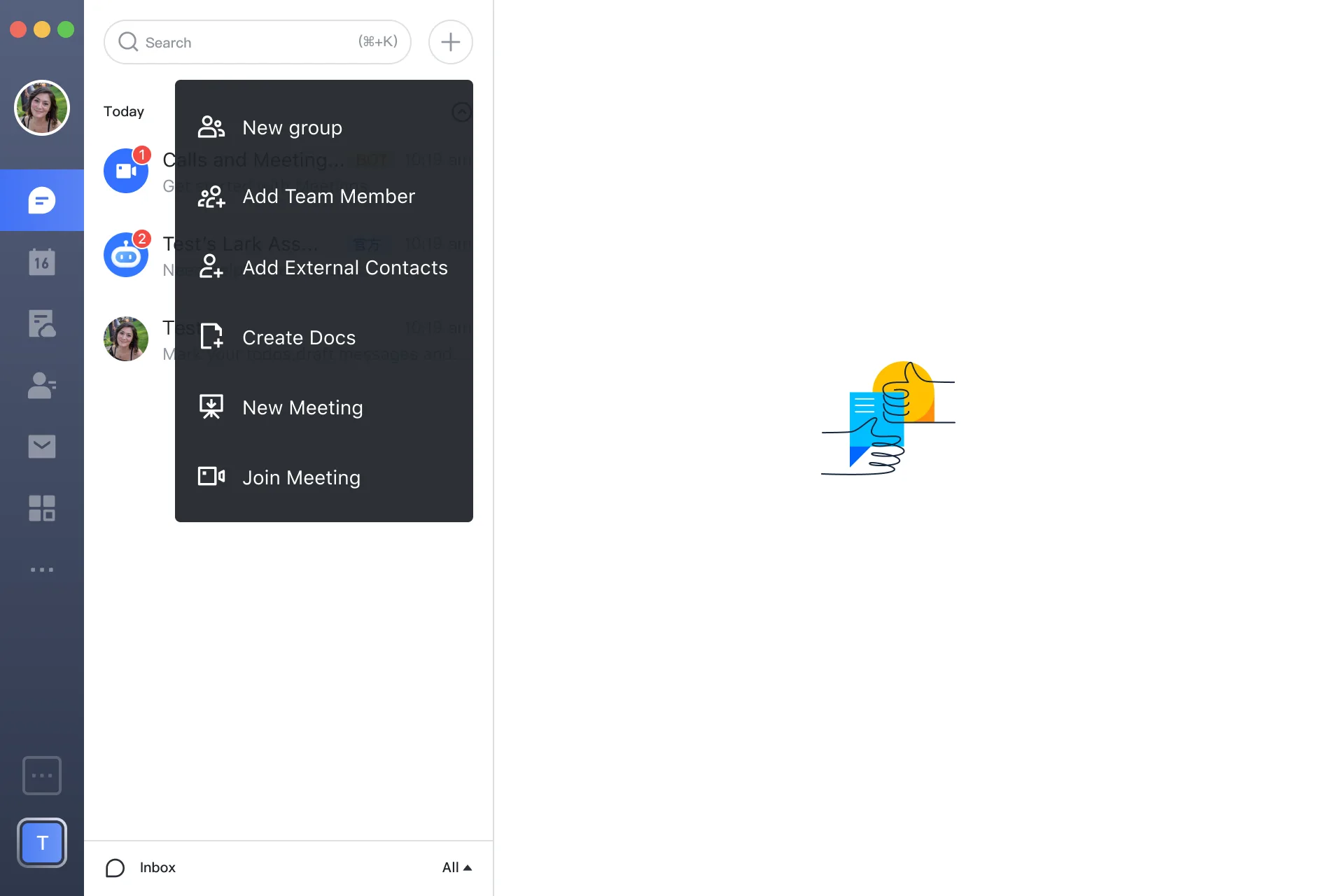
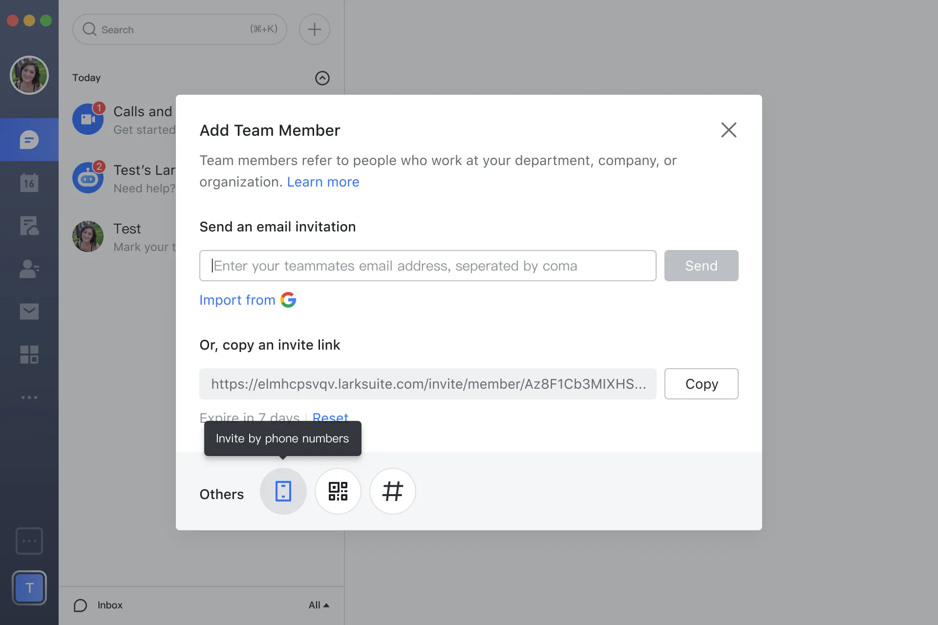
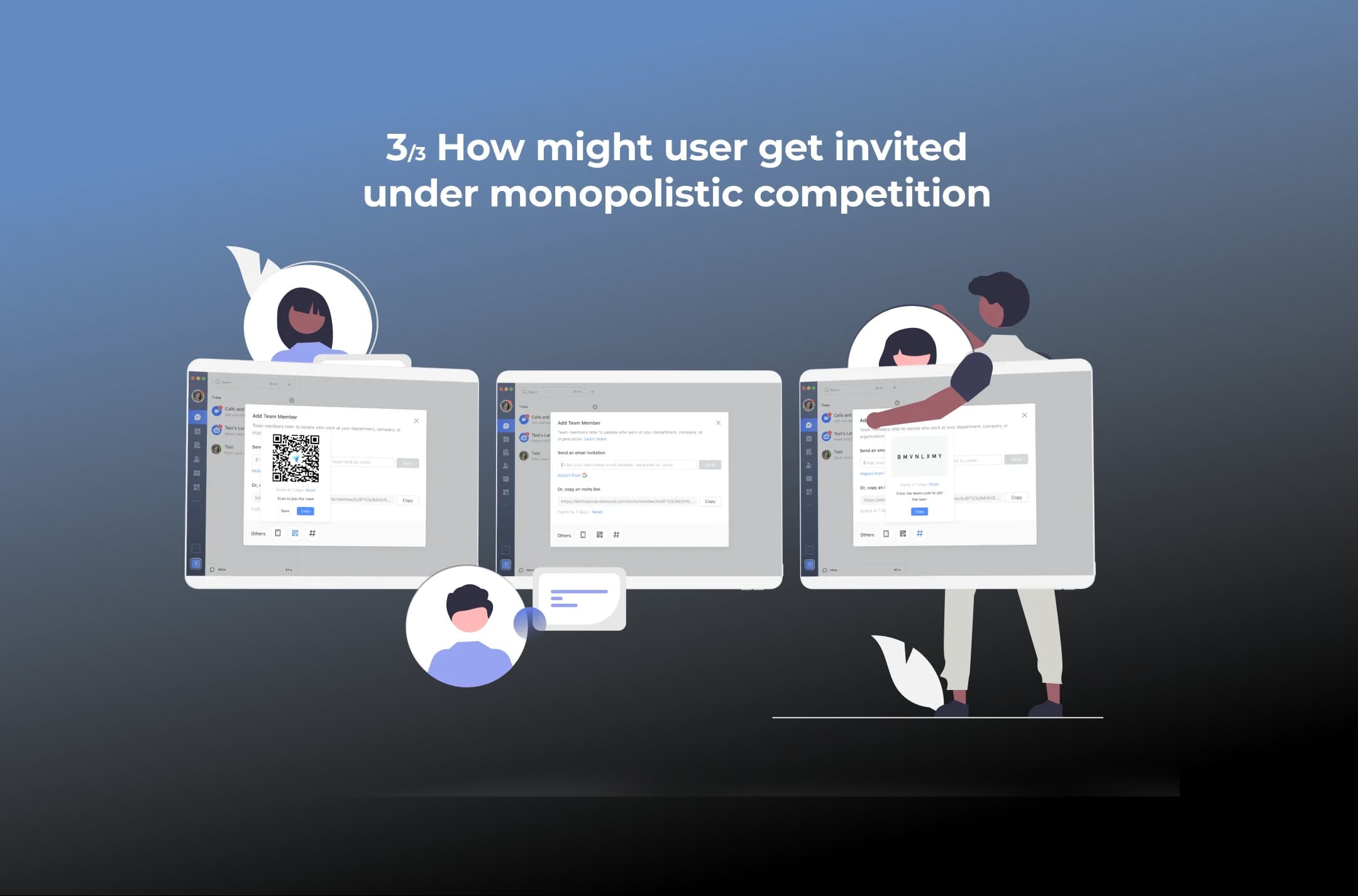
I start with a minimum quality bar to enable the invitation of users for all contexts. In this case, we curated several ways to spread member invitation resources:
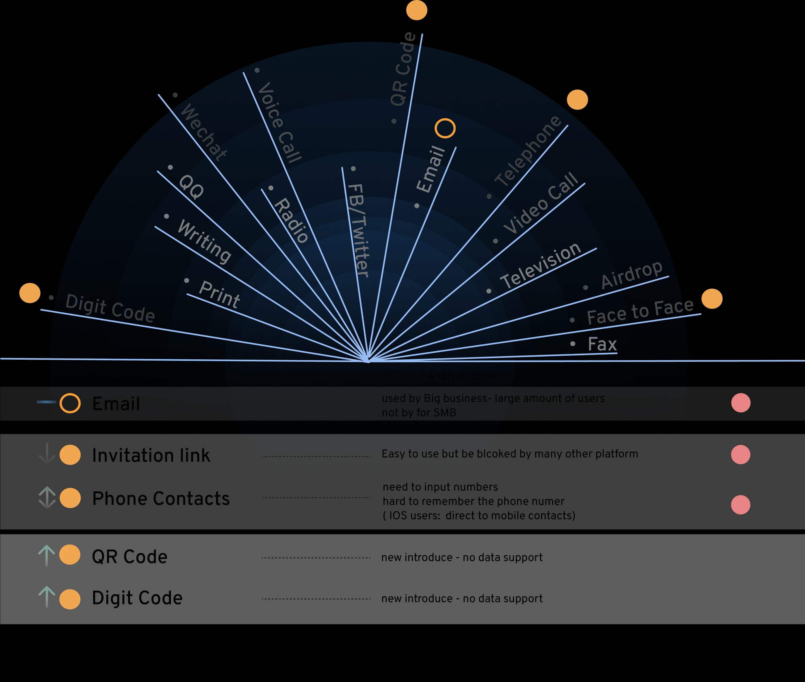
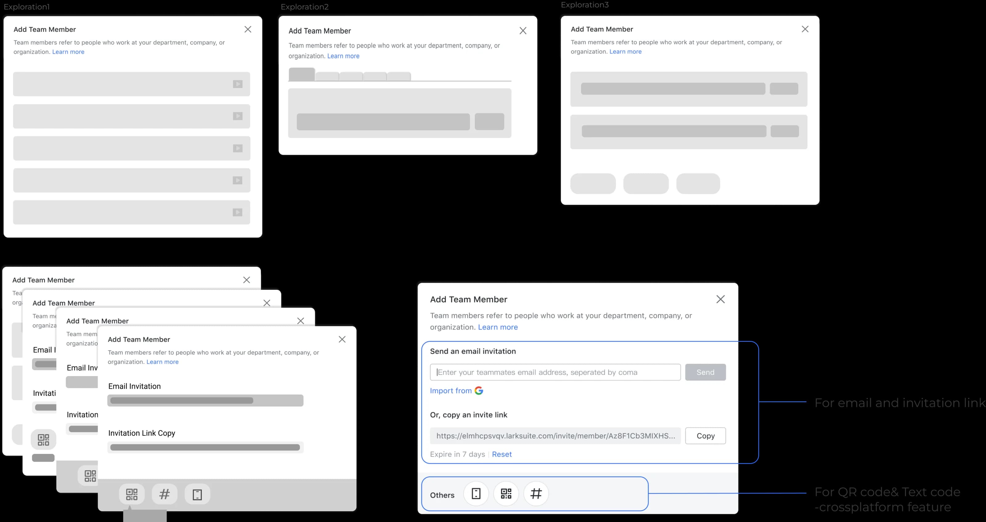
With a clear information structure based on the penetration rate for each method and information density, we have developed seven different design sketches for team member invitations
Design 03
A guaranteed, diverse, and inclusive design
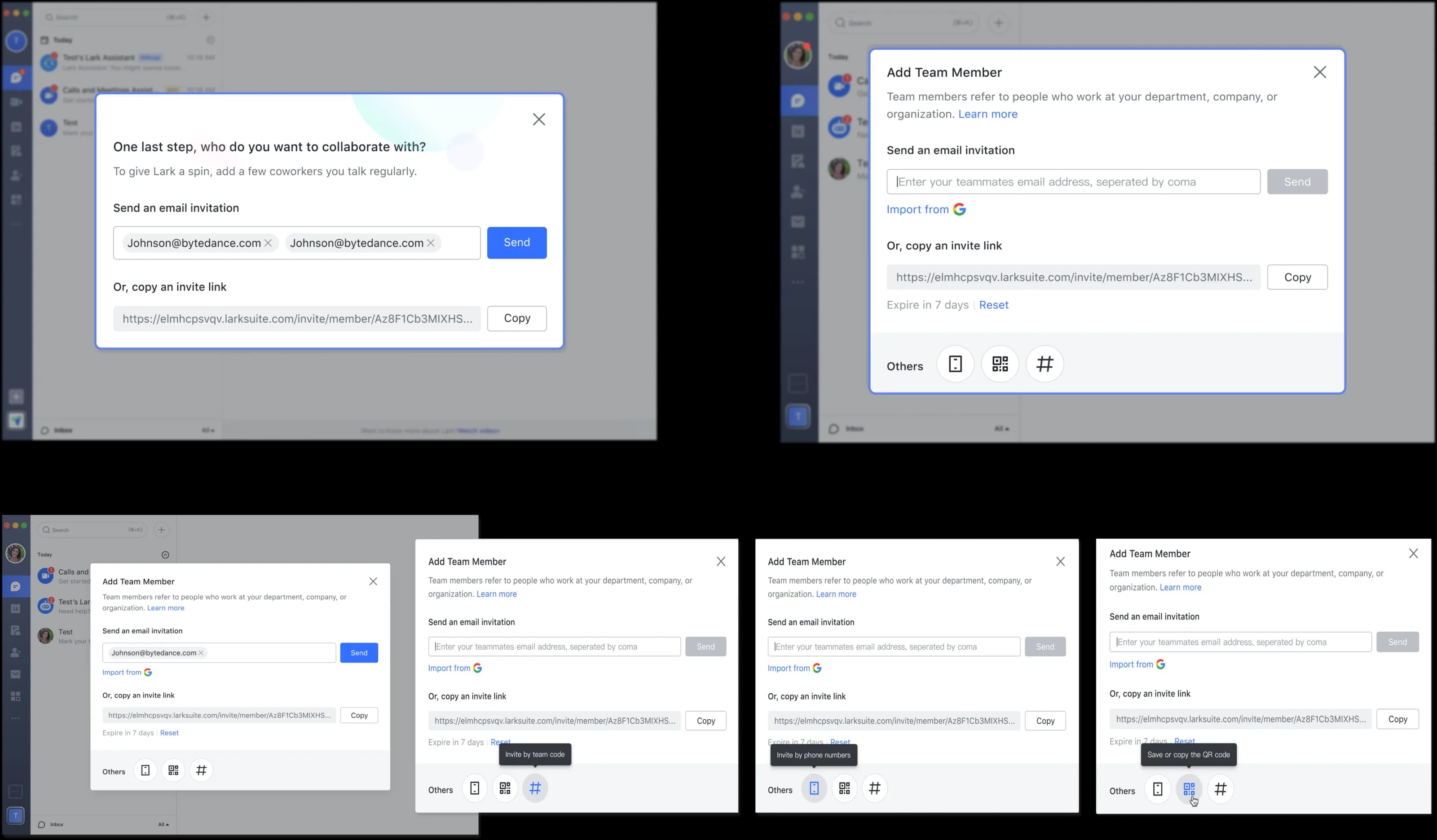
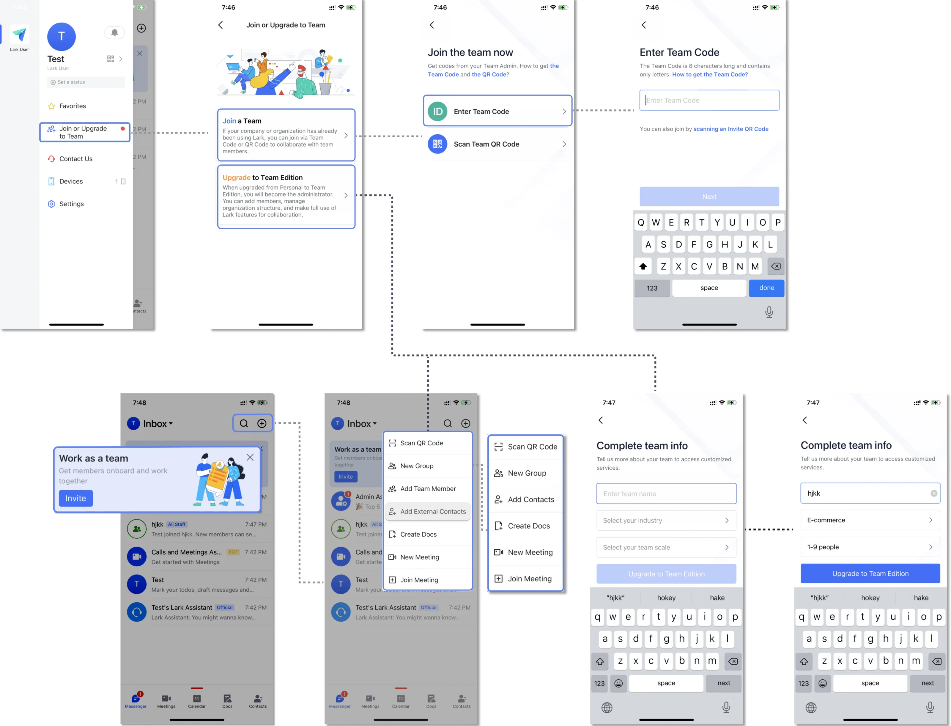
Final design